Coming soon... 👀#RaysUp pic.twitter.com/FloUetGMd1
— Tampa Bay Rays (@RaysBaseball) January 26, 2023
The 25th anniversary logo for the Rays has officially arrived, and for the club, it is a bit of a change from their most recent anniversary logo back in 2018.
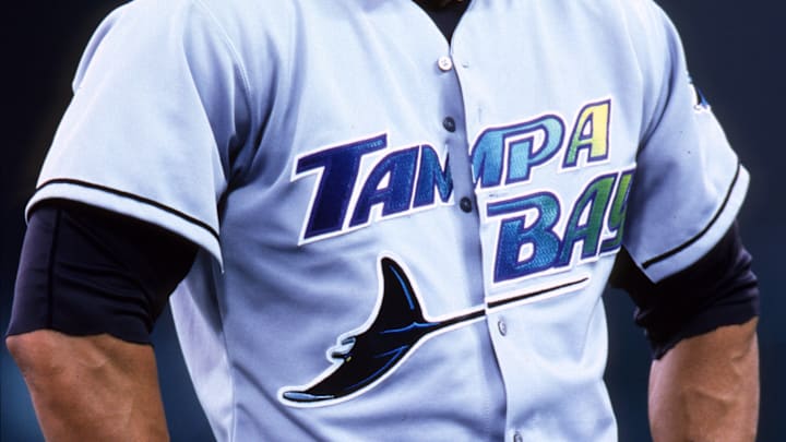
The Rays anniversary logo features a more Devil Rays-ish look, as the main components are set in front of what is known as the "old school" Devil Rays oval that is seen on hats from the original days of the team and even on the new alternates.
The logo features the two key alternate logos that the Rays have used for years, the stingray logo and the "sunburst" logo, around the numbers "25," which are not aligned with one another.
According to the Rays site, the first real opportunity Rays fans will get to see this logo "will be at Rays Fan Fest," as fans will get the chance to presumably purchase the logo on team hats, shirts, and jerseys, just to name a few potential items.
This is now the fourth anniversary logo that the team has released, having come out with a 20th, 10th, and inaugural season logo for each of those years.
This will actually be the team's first -5th anniversary logo, not having one for their fifth and 15th anniversary seasons.
This logo will also be the second time that the Rays have had an anniversary design that uses their current team colors, having used the original colors and the controversial green and black color scheme for the team's first two.
In terms of anniversary logos, it is not a bad logo by any means; however, with the unaligned numbers, it does create a weird visual, possibly swaying away Rays fans, but get used to it; we will be seeing much of it this season.
